CSS3 转换
CSS3转换,我们可以移动,比例化,反过来,旋转,和拉伸元素。

它是如何工作?
变换的效果,让某个元素改变形状,大小和位置。
您可以转换您使用2D或3D元素。
浏览器支持
Internet Explorer 10, Firefox, 和 Opera支持transform 属性.
Chrome 和 Safari 要求前缀 -webkit- 版本.
注意: Internet Explorer 9 要求前缀 -ms- 版本.
2D 转换
在本章您将了解2D变换方法:
- translate()
- rotate()
- scale()
- skew()
- matrix()
在下一章中您将了解3D转换。


实例
运行一下 »div
{
transform: rotate(30deg);
-ms-transform: rotate(30deg); /* IE 9 */
-webkit-transform: rotate(30deg); /* Safari and Chrome */
}
translate() 方法
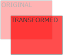
translate()方法,根据左(X轴)和顶部(Y轴)位置给定的参数,从当前元素位置移动。
实例
运行一下 »div
{
transform: translate(50px,100px);
-ms-transform: translate(50px,100px); /* IE 9 */
-webkit-transform: translate(50px,100px); /* Safari and Chrome */
}
translate值(50px,100px)是从左边元素移动50个像素,并从顶部移动100像素。
rotate() 方法
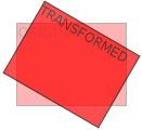
rotate()方法,在一个给定度数顺时针旋转的元素。负值是允许的,这样是元素逆时针旋转。
实例
运行一下 »div
{
transform: rotate(30deg);
-ms-transform: rotate(30deg); /* IE 9 */
-webkit-transform: rotate(30deg); /* Safari and Chrome */
}
rotate值(30deg)元素顺时针旋转30度。
scale() 方法
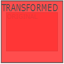
scale()方法,该元素增加或减少的大小,取决于宽度(X轴)和高度(Y轴)的参数:
实例
运行一下 »div
{
transform: scale(2,4);
-ms-transform: scale(2,4); /* IE 9 */
-webkit-transform: scale(2,4); /* Safari and Chrome */
}
scale(2,4)转变宽度为原来的大小的2倍,和其原始大小4倍的高度。
skew() 方法
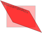
skew()方法,该元素会根据横向(X轴)和垂直(Y轴)线参数给定角度:
实例
运行一下 »div
{
transform: skew(30deg,20deg);
-ms-transform: skew(30deg,20deg); /* IE 9 */
-webkit-transform: skew(30deg,20deg); /* Safari and Chrome */
}
skew(30deg,20deg)是绕X轴和Y轴周围20度30度的元素。
matrix() 方法
matrix()方法和2D变换方法合并成一个。
matrix 方法有六个参数,包含旋转,缩放,移动(平移)和倾斜功能。
实例
利用matrix()方法旋转div元素30°
运行一下 »div
{
transform:matrix(0.866,0.5,-0.5,0.866,0,0);
-ms-transform:matrix(0.866,0.5,-0.5,0.866,0,0); /* IE 9 */
-webkit-transform:matrix(0.866,0.5,-0.5,0.866,0,0); /* Safari and Chrome */
}
新转换属性
以下列出了所有的转换属性:
| Property | 描述 | CSS |
|---|---|---|
| transform | 适用于2D或3D转换的元素 | 3 |
| transform-origin | 允许您更改转化元素位置 | 3 |
2D 转换方法
| 函数 | 描述 |
|---|---|
| matrix(n,n,n,n,n,n) | 定义 2D 转换,使用六个值的矩阵。 |
| translate(x,y) | 定义 2D 转换,沿着 X 和 Y 轴移动元素。 |
| translateX(n) | 定义 2D 转换,沿着 X 轴移动元素。 |
| translateY(n) | 定义 2D 转换,沿着 Y 轴移动元素。 |
| scale(x,y) | 定义 2D 缩放转换,改变元素的宽度和高度。 |
| scaleX(n) | 定义 2D 缩放转换,改变元素的宽度。 |
| scaleY(n) | 定义 2D 缩放转换,改变元素的高度。 |
| rotate(angle) | 定义 2D 旋转,在参数中规定角度。 |
| skew(x-angle,y-angle) | 定义 2D 倾斜转换,沿着 X 和 Y 轴。 |
| skewX(angle) | 定义 2D 倾斜转换,沿着 X 轴。 |
| skewY(angle) | 定义 2D 倾斜转换,沿着 Y 轴。 |